The general idea behind Jess’ technical whitepaper is to create a more visual, easier to manipulate way for humans & AI to work together, where none of the background work is ‘forever hidden’ like we experience with the chat interface of modern LLMs.
In our early discussions, we envisioned a screen where various squares represent various work areas or functions that you can move artifacts and agents amongst….and doing so will square the productivity of any human plugged in. Hence the current codename: work squared.
With the idea that we’re starting from square one on creating an AI native environment or operating system for humans to become radically more effective, I’m taking today to get back to the basics, wandering through some of the most famous and disruptive square based interfaces from the 80s & 90s. Retro Squares! The ideas of going back to computers when the computing power nor the graphics were capable of doing much may help uncover some needed tricks of the trade for simplifying or ‘humanifying’ an AI native environment.
The Candidates
AI suggests a murderer’s row of game changers, along with an-out-of-left field suggestion that is delightful!
1980s
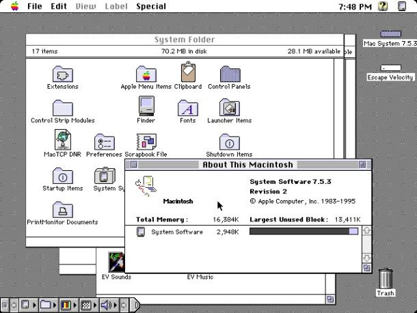
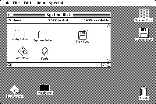
- Original Macintosh (1984) - Featured a 512×342 pixel screen with square icons and a grid-based desktop metaphor
- Windows 1.0 (1985) - Used a tiled window system where all windows were perfect squares or rectangles that couldn’t overlap
- Tetris (1984) - The iconic game interface built entirely from squares (!!!WOAH!!!)
- MS-DOS File Manager - Character-based interface with square selection highlights
- Commodore 64 GEOS - Grid-based interface with square icons for applications
1990s
- Windows 3.1 Program Manager (1992) - Featured program groups represented as squares containing square application icons
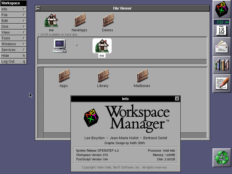
- NeXTSTEP - Steve Jobs’ post-Apple project with distinctive square/rectangular window elements and iconic dock
- AfterStep/WindowMaker - X Window System managers heavily inspired by NeXTSTEP’s square aesthetic
- IBM OS/2 Workplace Shell - Featured a distinctive square-based icon system
- Early Web Interfaces - Table-based HTML layouts creating rigid square/rectangular designs
Tetris is a really neat inspiration. My head is exploding a little bit on that one, but first things first, it’s time to remind myself of the OS experiences of my youth, and get caught up on some of the ones I missed:
Classic Software UI Safari
I’m quickly scanning around for inspiration.
NEXT NEXTstep
 Nope.
Nope.
Old School Mac!
 Nope.
Nope.
GEOS operating system (popular on Commodores)
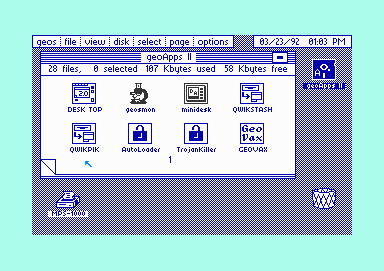
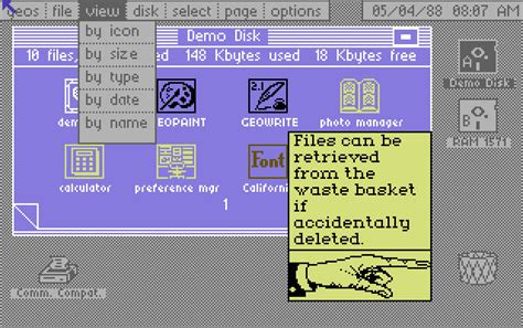 Nope- and it’s sinking in why this doesn’t feel right. I’m looking at screens for organizing the tools that you use to do work. These aren’t screens where the work is happening or being managed.
TETRIS! (1984)
This one came out of left field but as soon as I dig in, I realize that at least for the way my brain works, this was the only useful suggestion.
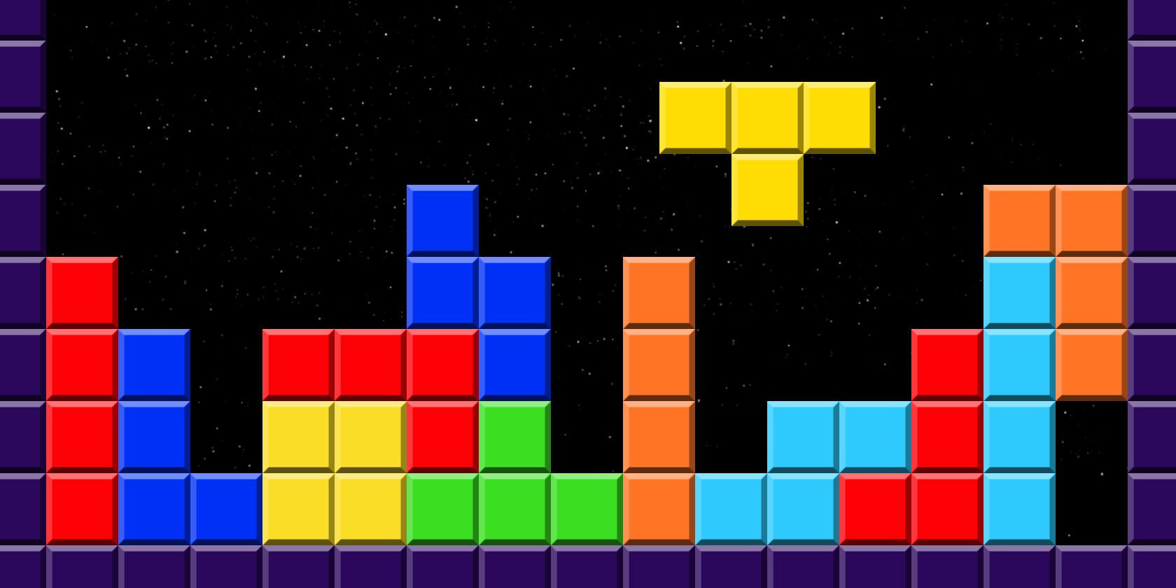
For look, feel, usability and vibe - I’m loving these primary, color blind friendly colors, bright and bold and SIMPLE. The soviet music & brand maybe isn’t as good of a fit.
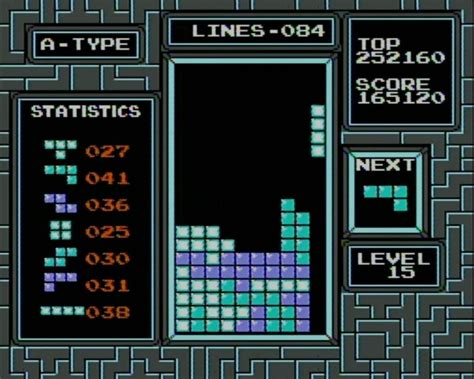
The user interface is no joke either. It could be considered as three equal rectangles:
- Details about the past.
- The action happening RIGHT NOW, and you’re DOING IT.
- Big picture at a glance - where are we, where are we heading, what’s next?
and had a nice configure-in-real-time with instant gratification and visual builds of ‘pileups’.
This wasn’t where I thought this was going, but I’m going to pause the squares concept for a spell and dig into old school video games of this same era for inspiration.
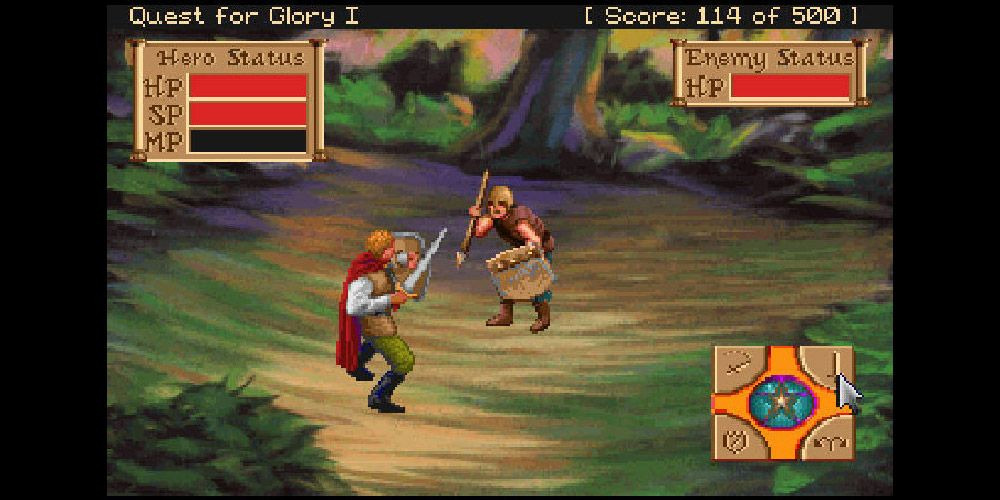
Sierra’s Hero Quest (1989)
I always come back to Sierra games as having built very different-for-the-time experiences:
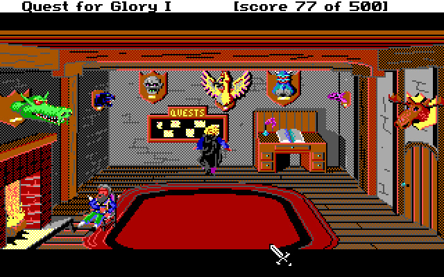
A screen is partially static, but it has ‘hot spots’ that you can click on and interact with. This was my favorite screen as a kid - the place where you signed up for and chose quests. I think the logbook may have told tales of your past daring. Your score was always hanging out up top, even in these ‘down times’.
The pixelation, vibrant colors and goofy animations are like the American equivalent of Nintendo nostalgia pixel art.
No real innovation here, but all of the basics:
A. Your primary square is the play area and it’s 80%+ of the experience B. Lower right has a visual UI where you click the basic instructions of what you want to have happen. C. Upper squares are real-time status of your primary capabilities that fuel your activities.
But I’m not really making too much progress from Tetris here. The ‘work motions’ of this game are roughly bifurcated between ‘Decide’ and ‘Execute’, but I always decide and I always execute. The computer element of the human-computer interaction is more about enablement than collaboration. This environment isn’t a lot like the environment we want to create.
What retro games turned work into play?
Thinking on it, the 1980s video game that was the closest to working a shitty spreadsheet job for me…was easily SimCity. I had several childhood friends who loved this thing….and a current day business partner who is passionate about it to this day!
SimCity (1989)
Oh man, now we’re talking.
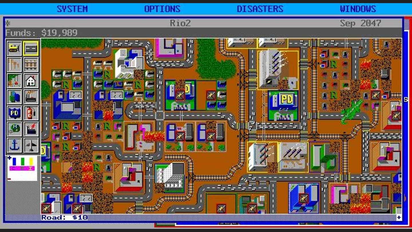
If you knew how to play, you’d design your city in zones or grids. (I’d just randomly slap stuff around like a maniac)
They’d be running on their own in real-time and you’d need to intervene to make changes. You’d constantly be getting updates on your productivity, your gains, your cost, your cash.
Creating a new type of productivity node was as simple as choosing from very clear icons across the left hand side of the screen. You just knew what they were supposed to do…and I think you could see a proximal overlay of coverage when you dropped down a fire department or police department.
A lot of times building one thing was a reaction to a lack of forethought in building something else. You made housing too smushed and now you either need parks or cops. You could demolish and replace things. Sometimes you’d just sit and watch it kick ass and take names for 3 years before realizing you needed to make a change.
The conceptual and emotional setting here is feeling right. As a human, I decide, I architect. I assign zones of responsibility to others - they execute. I observe, read reports, and modify. I can pause the ‘run’ to think hard about bigger decisions. I can experiment and learn by doing, utilizing different approaches to solving bigger labeled problems. I can see the big picture and zoom in and work on the ‘broken’ or ‘important’ parts.
📌 Thumb tacking this one - this is worth a deep dive. It’s a good model for using AI to implement a project regardless of project complexity.
But it’s missing a few decision layers that exist in most complex human orgs. A city is wildly complex, but it’s simplified so much that the UI only gets us part of the way there. I need to think bigger. Oh, of course….
Civilization I (1991)
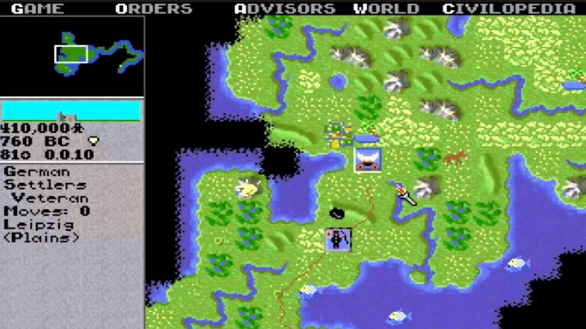
My best learning experience! You’re managing an empire, the world evolves around you and is shaped by your decisions. This was the first video game I ever wrote a strategy guide for, passing it around the playground to my friends.
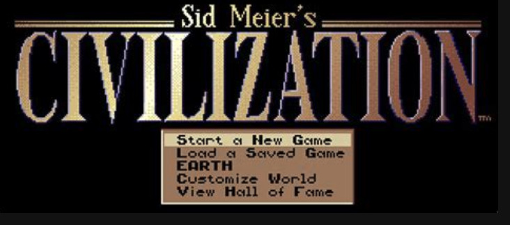
It’s interesting to think about the ‘home page’ of a sim. This one is a classic and the places it sends you to are very practical.
Not from the 80s, but the civilization game had advisor boxes where you could pop out and get advice on what to do next and why:
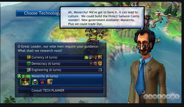 Civ Revolution, a newer, simpler version of a technology advisor.
The tech tree pictured is also no joke. Organizing the state of the art of your core knowledge and what solutions it enables is an interesting idea for keeping AI & humans singing from the same hymnal in what constitutes the state of the art. And heck, what an interesting way to communicate to the whole org what your frontier/experimental techs or tech priorities are!
I also like how some AI are expert advisors at the strategy level, but then you give marching orders to AI across numerous different task level functions - from farming to fighting.
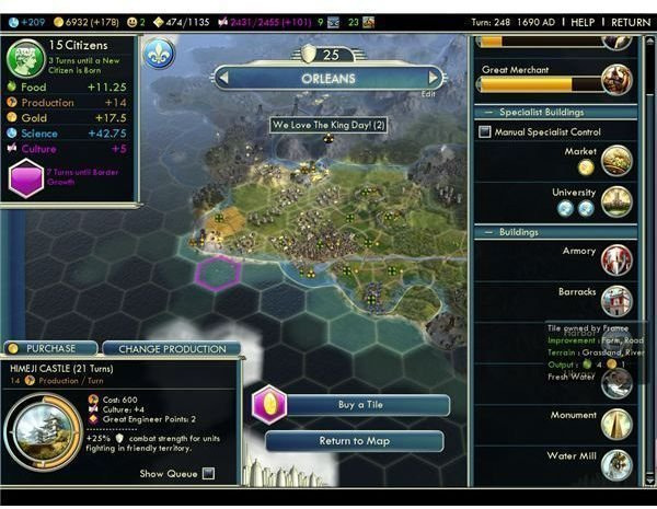 A more recent version of civ city management screen.
Notes for Future Fixing
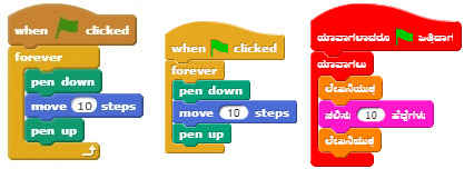
This safari has generated some really good ideas to play around with and frame up an autopoetic human-AI work interface. A city management screen is close, but not quite there. Note to future self – don’t forget Visual Coding.
Coding as building blocks: Snap!