
I’ve been playing around a lot with old school user interfaces to get some inspiration. So it was catnip when Jess said that Alan Kay thinks of user interface design from a system thinker’s perspective and that some of his thoughts, and struggles, on the subject are timeless. He provided this fun little xeroxed piece of Kay flavored brain candy.
The whole thing feels like gold to me, but there are a few pieces that hit the absolute hardest, the first being the top-down thinking on implementing Piaget’s work into UIs:
Bruner identified a separate mentality with each of Piaget’s stages: he called them enactive, iconic, and symbolic. While not ignoring the existence of other mentalities, he concentrated on these three to come up with what are still some of the strongest ideas for creating learning-rich environments.
- enactive - know where you are, manipulate
- iconic - recognize, compare, configure, concrete
- symbolic - tie together long chains of reasoning, abstract
The visual system’s main job is to be interested in everything in a scene, to dart over it as one does with a bulletin board, to change context. The symbolic system’s main job is to stay with a context and to make indirect connections. Imagine what it would be like if it were reversed. If the visual system looked at the object it first saw in the morning for five hours straight! Or if the symbolic system couldn’t hold a thought for more than a few seconds at a time!
Later on he shares some traits of the ultimately architected learning-creation environment:
The current state of things suggests what to do next. Extensive top-down planning is not required—just squish things around until you like the total effect. Of course, in a playpen like that, plans do come to mind and can be useful. But major things have to be accomplished by bottom-up exploration with obvious ingredients or end-user programming will not come to pass.
I’m loving Kay’s struggle here. It’s inspiring some big ideas.
A trait is its modeless context-freeness. In most iconic languages, it is much easier to write the patterns than it is to read them. One of the most interesting puzzles in iconic programming (and iconic communication in general) is why there is such a disparity between how understandable images are while they are actively being constructed and how obscure even one’s own constructions can appear even the next day. I believe that the major reasons for this can be accounted for as a consequence of semantic focus—analogous to that of foveal vision, but having to do with the amount of meaning and connectivity that can be solved by looking at a diagram. A suggestive explanation is found in Minsky’s and Papert’s book Perceptrons [1969], where they show that certain diagrams are beyond the level of complexity that a perceptron of a given aperture can solve.
It is obvious why constructing a diagram is much less difficult than trying to read one. During construction, one is controlling focus by looking only at the parts that seem relevant at the time. The general strategy of the diagram is already part of the context and doesn’t have to be ferreted out. The analogy to writing prose is quite clear, but prose has the advantage that a writer can employ considerable foreshadowing and building up of context before getting to the main point. The scene can be set at will. Except for a few stereotypes, this is extremely difficult to do with an image. What does this imply for iconic communication?
To boil down the points in here that lit me up:
- More times than not a clear path to getting into symbolic, abstract work is via enactive environmental elements that then take on symbolic value.
- Reading a diagram, particularly a complex one, is harder than making one, in part because when we make one we can focus on what’s relevant to us right now and then move on whereas just sitting and seeing the whole diagram at once can be pretty darn overwhelming and also confusing.
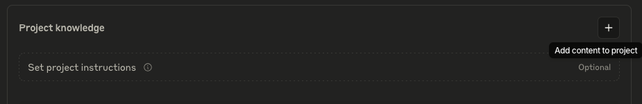
Strangely enough, reading all of this led me to some internal lightning strikes on why and how Claude projects is my fastest way to work but how my attempts to convert friends to the practice have fallen horribly short.
The realized experience of many for chat based LLMs is similar to one of my most frustrating learning environments as a child: MS-DOS. But in my imagination, I experience Claude projects the same way that my kids played with one of their favorite toys: Snap Circuits!
DOS Claude
When I was a kid, my second major iteration with computers was working in DOS.
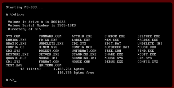
There was stuff on my computer if I knew how to find it. I could get it to do stuff if I knew how to ask. Most of the time, I could get it to do stuff. But sometimes I couldn’t - it wasn’t clear what was breaking or how to fix it - I would just get a line of text about an error. My video game wouldn’t run. My system wouldn’t stop crashing. And my inability to navigate behind the scenes to fix it literally led me to the angriest moments of my childhood! It was like my computer was willfully trying to beat me at hide and seek.
Claude’s chat interfaces are largely those same vacuous screens, with blinking cursors, where knowing what to do gets me a big, rewarding wall of text!
The Blank Cursor: MS-DOS and Claude Through Bruner’s Developmental Lens
Both present what we might call “high-floor environments” - spaces with minimal scaffolding that demand immediate symbolic thinking.
Enactive Representation (Action-based)
Command-line interfaces and conversational AI are notably limited in enactive elements:
- Minimal physical interaction beyond typing (no manipulation of physical (or digital-manipulable objects)
- Delayed feedback loops (commands must be fully typed before execution)
- Limited sensory engagement (primarily visual, with minimal audio feedback)
This creates a significant barrier for novices, as Bruner would note that without enactive foundations, higher-level understanding becomes more challenging.
Iconic Representation (Image-based)
Text-based interfaces are similarly sparse in iconic elements:
- Monochromatic visual environment (black screens with white/green text)
- Absence of spatial organization (information appears in linear sequences)
- Limited visual differentiation between different types of elements
- Few visual metaphors to bridge concrete and abstract concepts
The lack of visual scaffolding forces users to jump directly to symbolic thinking without the intermediate iconic stage that Bruner identified as crucial for cognitive development.
Symbolic Representation (Language-based)
These environments operate almost exclusively at the symbolic level. As a kid, my experience here with MS-DOS was quite challenging:
- Command syntax requires precise spelling and parameters
- Abstract terminology with minimal connection to physical referents
- Rigid grammar that follows computational rather than natural language patterns
- Conceptual organization that demands understanding hierarchical relationships
- Error messages that require interpretation and problem-solving
Now, I’ll be the first to admit that Claude does not suffer from the complexity and finickiness of DOS at the symbolic representation level – I’ve written plenty of incomplete sentences in only moderately comprehensible English where my drift was caught, and good work was done.
I know plenty of business folk who use Claude to help with emails and single problem brainstorming who would tell you the same thing.
But Claude projects where we’re dealing with a more complex problem solution pairing with numerous inputs and numerous layers of outputs (many of which become inputs into the project as it matures)…I’m starting to think of how an environment largely bereft of enactive and iconic representation is a DOS level cold start for many.
So why has using Claude projects been so fun and easy and wonderful for me? The imaginary inner world I work in before typing a single character into my projects! Its origin hearkens back to the modern day evolution of one of my favorite childhood toys.
Snap! A Modern Day Learning Nest
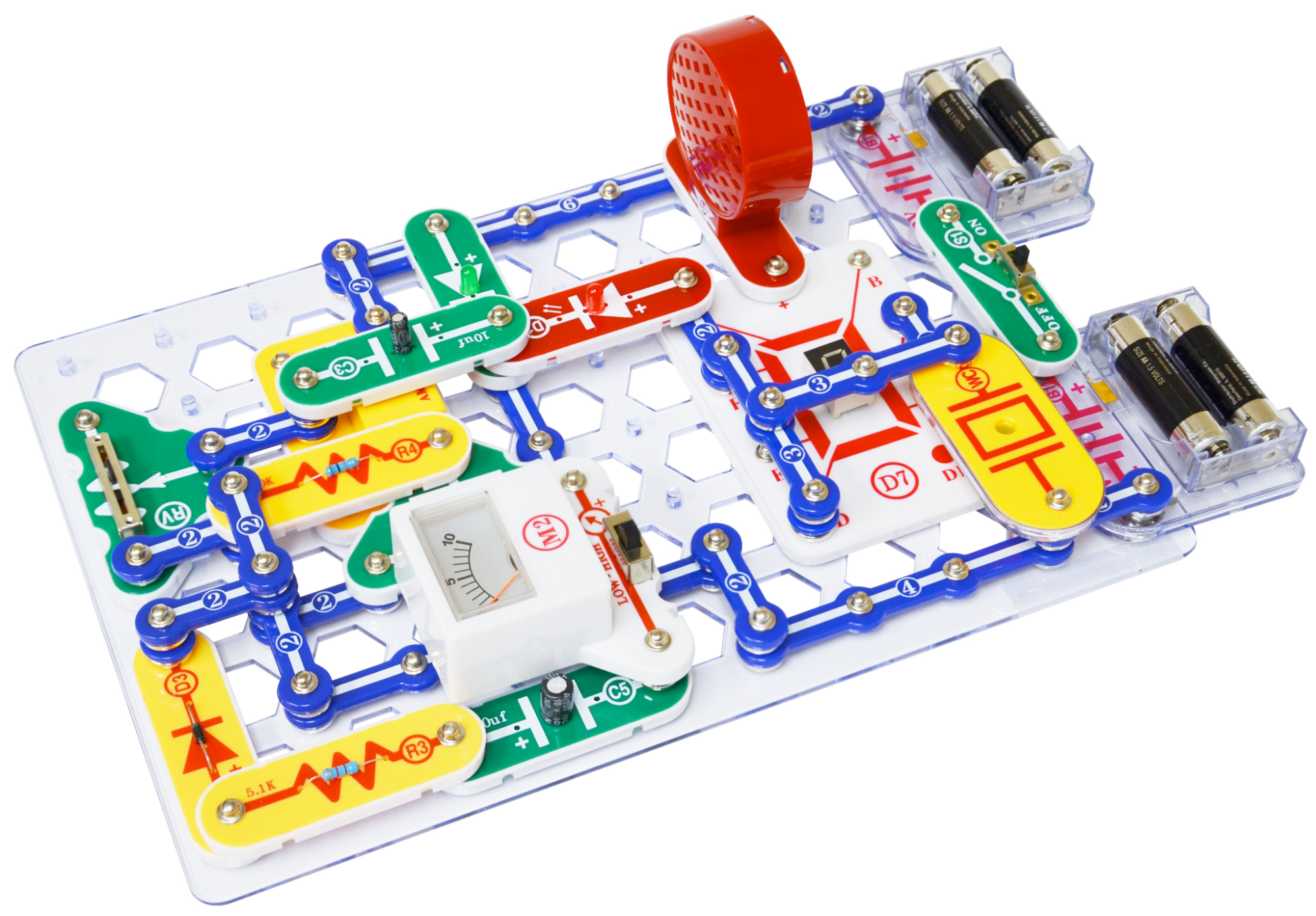
Have you or someone you know and/or love ever played around with Snap Circuits? They’re a pretty neat little concept.
Kids are given a parts list and a diagram that maps onto a general board, and then some light conceptual support in the form of a paragraph or two of text that speaks to some of the what, how and why of the paint-by-numbers style creation.

The best part is that you can lay the diagram and context out next to your board while you build - comparing ‘your’ build to the ‘actual’ right when it’s most helpful.
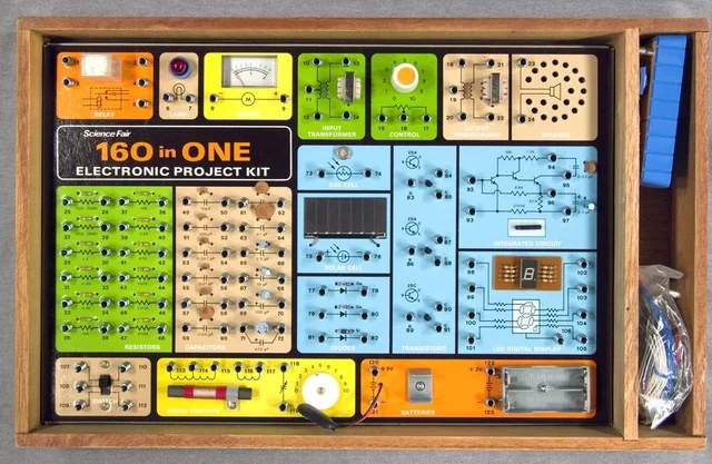
They’re an evolution over my favorite childhood RadioShack toy, the X-in-1, which got hundreds of my hours in grade school and was basically the same concept except that you were limited to the board you bought and you used wires to connect it up:
Bruner’s Stages of Representation in Snap Circuits: A Developmental Analysis
The Snap Circuit experience is very different from DOS or Claude.
Enactive Representation (Action-based)
Snap Circuits excels in the enactive domain by providing:
- Direct physical manipulation of colorful components that snap together with satisfying tactile feedback
- Immediate sensory consequences when circuits work (lights illuminate, motors spin, speakers sound)
- Embodied learning as children develop muscle memory for how components connect
- Concrete cause-effect relationships reinforced through physical actions
This hands-on aspect is crucial because, as Bruner emphasized, children first understand concepts through direct action and physical engagement before moving to more abstract representations.
Iconic Representation (Image-based)
The transition to iconic thinking is supported through:
- Visual instruction manuals showing pictorial representations of completed circuits
- Color-coded components that create mental associations between appearance and function
- Circuit diagrams that teach children to “read” a two-dimensional representation of a three-dimensional object
- Visual patterns that become recognizable across different projects (e.g., power sources always connect to other components in particular ways)
These iconic elements serve as a bridge between concrete actions and abstract concepts, allowing children to mentally visualize electrical flow even when they can’t directly see it.
Symbolic Representation (Language-based)
As children advance with Snap Circuits, they encounter increasingly symbolic elements:
- Technical vocabulary (resistance, voltage, current, polarity)
- Standard electronic symbols on more advanced circuit boards
- Numerical measurements when projects incorporate meters
- Logical reasoning about why circuits function or fail
- Abstract rules governing electrical principles that transcend specific examples
This progression from enactive to iconic to symbolic representation is a great example of Bruner applied real life!
I’ll redraft “The Claude of My Imagination” section using our new Innovation Amplifier Circuit metaphor:
The Claude of My Imagination
When I sit down to create a Claude project, I am very much imagining a snap-circuit like project. Take for example the prep work needed for our first UI jam.
When I approached this Claude project, what’s happening in my head is actually much more structured than what ends up getting typed in front of that blinking cursor. I’m not staring at a void - I’m seeing a blank snap circuit board for making a little stereo-box of sorts, with all my components organized neatly beside it and a diagram for filling it in:
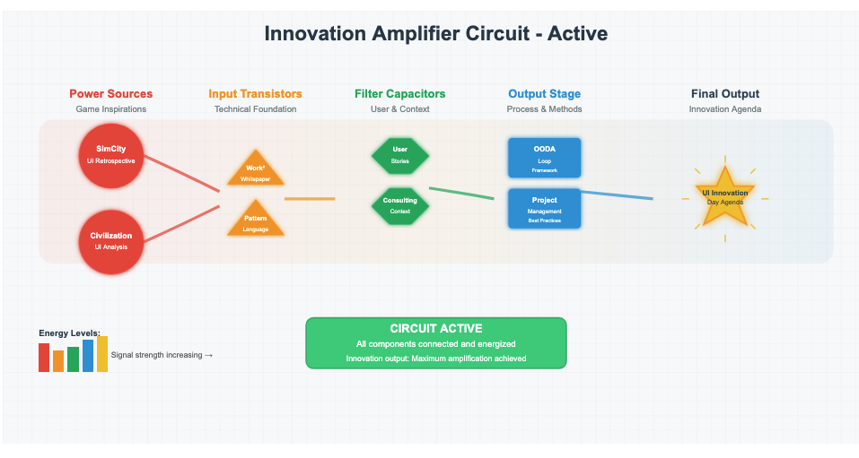
🔴 Power Sources: Where Raw Energy Begins
In any amplifier, you need power sources - the raw electrical energy that drives everything else. Without power, even the most sophisticated circuit is just decorative metal. When I started planning our innovation session, I knew I needed creative voltage, and that meant diving deep into the games that revolutionized UI design.
My power sources weren’t batteries - they were comprehensive UI analyses:
- SimCity (1989): Raw creative energy from Will Wright’s sandbox revolution
- Civilization (1991): Pure strategic voltage from Sid Meier’s complexity-made-simple
These aren’t just documents; they’re generators. Like batteries in a circuit, they provide the initial creative current that will flow through our entire innovation process. I spent hours crafting these retrospectives because I knew: weak power sources mean weak output. You can’t amplify what isn’t there.
🟡 Input Transistors: Amplifying the Signal
Here’s where non-engineers often get confused, so let me explain: transistors are magical little components that take a tiny signal and make it bigger. They’re amplifiers at the component level. Without them, your power source might have energy, but it’s too weak to be useful.
In my mental circuit board, the technical foundation documents are my transistors:
- Work Squared Technical Whitepaper: This takes the raw game inspiration and amplifies it through our technical lens
- Pattern Language for Computing: This boosts the signal by connecting it to broader design principles
These documents don’t generate new energy - they amplify what’s already there. They take “SimCity had a cool minimap” and transform it into “spatial information visualization creates ambient awareness in collaborative environments.” That’s amplification.
🟢 Filter Capacitors: Storing and Focusing Energy
Capacitors are components that store electrical energy and release it smoothly. But more importantly for our metaphor, they act as filters - removing noise and letting through only the signals we want. In audio amplifiers, they’re what keep your music from sounding like static.
My filter capacitors are all about context:
- User Stories: These store up detailed scenarios of how consultants actually work
- Consulting Context: These filter our innovation through the lens of real organizational needs
Without these filters, we’d be designing in a vacuum. The user stories and context documents take our amplified creative signal and filter out what won’t work for our specific users. They store up domain knowledge and release it precisely when needed, ensuring our innovations are grounded in reality.
🔵 Output Stage: Shaping for Real-World Operation
In an amplifier, the output stage doesn’t just deliver power - it also shapes the signal to match what the speakers can actually handle. It ensures the amplified signal won’t blow out your speakers or distort when it meets the real world.
This is exactly what these components do in my Claude project:
- OODA Loop Framework: Shows how decisions actually get made in fast-paced consulting environments
- Project Management Methods: Reveals the operational realities of how work flows in organizations
These aren’t tools for building our innovation - they’re the operational constraints that our innovation must work within. Just like an output stage protects speakers by matching impedance and preventing overload, these documents ensure our UI innovations will actually function in the high-pressure, rapid-decision world of consulting.
Without this stage, we might design beautiful interfaces that assume unlimited time for reflection, or that ignore how consultants actually organize and track their work. The OODA loops and project management frameworks act like a reality filter - they shape our amplified creative signal into something that can actually drive results in the real world of consulting.
⚪ Final Output: The Innovation Agenda
When all components are connected and energized, the final output isn’t just the sum of its parts - it’s transformed.
The Complete Circuit: Context as Multi-Stage Filtering
Looking at the full circuit now, I see three distinct types of context filtering happening:
- 🟡 Technical Amplification: The whitepaper and pattern language boost the raw game inspiration into computing concepts
- 🟢 User Filtering: User stories and context docs filter for what consultants actually need
- 🔵 Operational Shaping: OODA and project methods shape the output to work within real organizational constraints
Each stage refines the signal further, ensuring that when we reach the final output - our Innovation Agenda - it’s not just creative and technically sound, but also perfectly matched to the impedance of the real working world.
Building the Circuit: From Mental Model to Reality
When I finally sit down to write the prompt, I’m not composing from scratch. I’m describing a circuit that’s already complete in my mind. I can see how the power flows:
- Game analyses generate creative current
- Technical documents amplify that current into powerful concepts
- User context filters out noise and focuses the signal
- Process frameworks shape the output to work within real constraints
- Innovation agenda radiates the combined energy outward
The prompt I write is really just instructions for Claude to build the same circuit I’ve already tested in my imagination:
Why This Matters: The Invisible Circuit Board
Most people approaching Claude projects are trying to build circuits without understanding components. They’re connecting random wires and hoping for illumination. But when you understand that:
- Some documents provide energy (power sources)
- Some documents amplify signals (transistors)
- Some documents filter and focus (capacitors)
- Some documents shape output for reality (output stage)
…then you can build circuits that actually work. You’re not just throwing documents at Claude and hoping for magic - you’re building an innovation amplifier with purpose and precision.
The Gap Between DOS and Snap Circuits
This is why my Claude projects feel less like typing into DOS and more like building with Snap Circuits. I can see the circuit before I build it, I understand what each component does, and I know how they’ll work together to amplify my initial creative spark into something powerful enough to change how we work.
But here’s the thing: when I tell my friends to “just use Claude projects,” I’m essentially handing them a box of unmarked electronic components with no circuit board, no color coding, and no instruction manual. They don’t see the amplifier circuit in their mind. They don’t know which documents provide power versus which ones filter noise. They’re staring at that blinking cursor, trying to build something when they can’t even visualize what they’re building.
It’s like expecting someone to build a working amplifier when they’ve never seen a circuit diagram. They might have all the right components scattered on their desk - brilliant analyses, thoughtful user research, innovative ideas - but without the mental model of how these pieces connect and amplify each other, they’re just typing into the void.
From Individual Circuits to Complete Systems
What makes this even more challenging is that my amplifier circuit is just one task in one project. Across an entire organization, there are hundreds of these circuits that need to be built, each requiring its own careful selection of power sources, amplifiers, filters, and output stages. I can hold maybe a dozen of these circuit patterns in my head, but I certainly can’t design mental models for every task in every project across every division.
That’s exactly why we’re building Work Squared - to make these invisible circuit boards visible, to color-code the components, to show how energy flows from raw inspiration through multiple stages of refinement to actionable output. We’re trying to give everyone their own Snap Circuits kit for AI-powered work, complete with:
- Clear component types that are visually distinct
- Obvious connection points between different elements
- Visible energy flow so you can see what’s working
- Pre-built patterns for common circuits
- The flexibility to create new configurations
Until then, I’ll keep building my mental amplifier circuits, transforming game retrospectives and technical papers into innovation agendas. But I’m increasingly aware that the real innovation isn’t in any individual circuit I create - it’s in making the circuit board itself visible to everyone else.